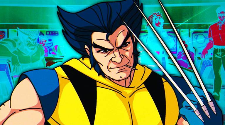
X-Men ‘97 Directors Want an Animated Film to Rival the Spider-Verse Movies
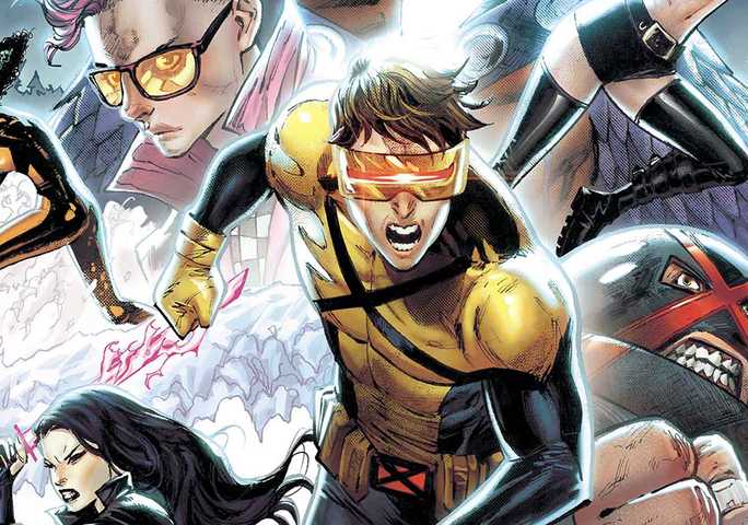
The directors of X-Men ‘97 are pushing to make a full-length feature that will rival the best animation releases.
The directors of X-Men ‘97 are pushing to make a full-length feature that will rival the best animation releases.

Nearly a decade after its announcement, the Yuri!!! On Ice the Movie: Ice Adolescence is now officially canceled by anime studio MAPPA.
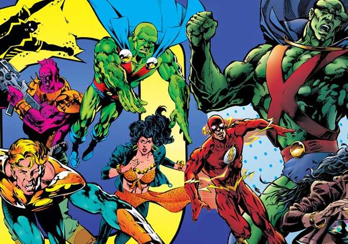
In a feature spotlighting how comic series often evolve, CSBG sees how Justice League Task Force went from Mission: Impossible to being a hero school
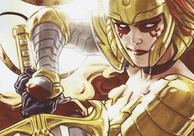
In their latest look at notable comic book retcons. CSBG looks to see how Angela was retconned into the Marvel Universe as Thor's sister
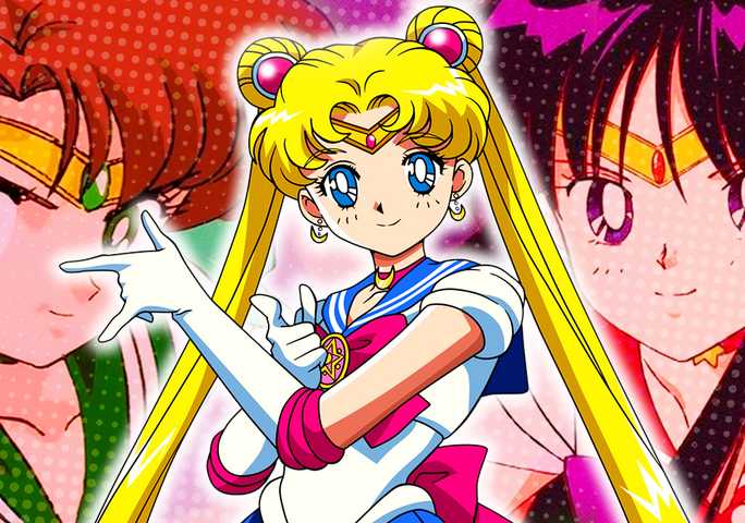
Sailor Moon's Sailor Scouts aid her in fighting evil with their own powers who derive their powers from the planets they come from.

The director of Transformers One addresses the film's true villain following the release of the first trailer.

KonoSuba is finally entering the third season of its anime adaptation, leaving some fans wondering where the spinoff show about Megumin fits in.

It might be prudent for Luffy and his crew to act more like pirates and pick up some firearms, even if they have moves stronger than any gun.

There are reportedly plans at Disney+ for a change to make the streaming service more reminiscent of traditional cable TV.

Fallout's producers respond after Amazon officially renews the series for Season 2 at Prime Video!

The Last of Us gets its impressive streaming viewership record broken at Max.

Marvel 1943: Rise of Hydra has a lot going into it beyond an original story, being inspired by years of comic book lore.
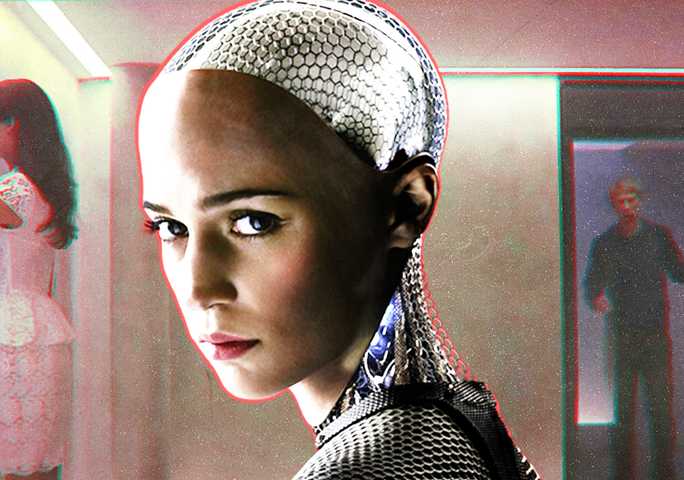
Alex Garland's Ex Machina carved out a harrowing ending that gave Hollywood one of its most provocative artificial intelligence stories ever told.
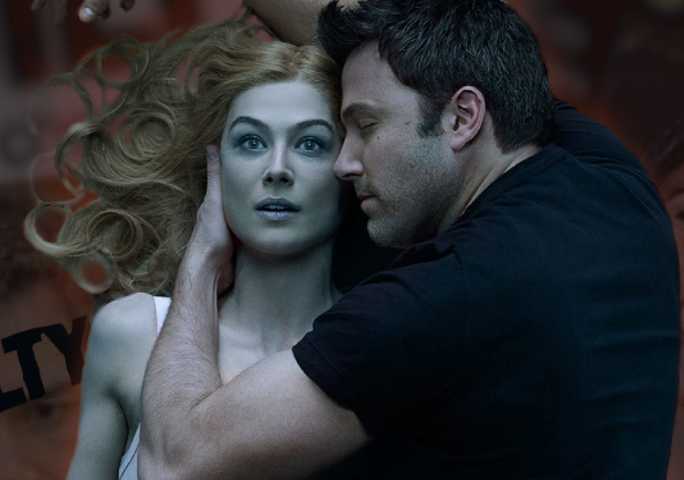
Gone Girl isn’t technically a true story, but a tragic true-crime case and the subsequent media circus somewhat inspired the source novel.

Fallout series co-creator Jonathan Nolan teases that Aaron Paul may want a role in a potential second season.

In Game of Thrones and House of the Dragon, dragons are an essential weapon for House Targaryen, but how do they even come to exist at all?

Isildur, the first King of Gondor, was a legendary figure in J. R. R. Tolkien's The Lord of the Rings, but his younger brother was an overlooked hero.

One Piece's Luffy will again 'split the sky' for his birthday, with Toei Animation launching giant inflatable balloons in multiple European cities.
The X-Men's highly anticipated From the Ashes era officially begins in Marvel's July 2024 solicitations.

Chicago PD Season 11, Episode 5, "Split Second" is one of the NBC show's best because of LaRoyce Hawkins as Kevin Atwater and a script worthy of him.

A new rumor claims that the original Silver Surfer will still appear in the Fantastic Four despite Julia Garner's casting.